HarborLight Hotels Branding Process
A warm, welcoming identity for a growing hotel chain.
HarborLight Hotels wanted a brand that felt calm, trustworthy, and inviting for travelers and families. We created a visual identity that reflects rest, hospitality, and a sense of home away from home.
Step 1 – Discovery & Strategy
We met with the HarborLight team to understand their locations, guests, and long‑term vision. Together, we defined key themes like rest, safety, and warmth to guide every design decision.
Step 2 – Concept Development
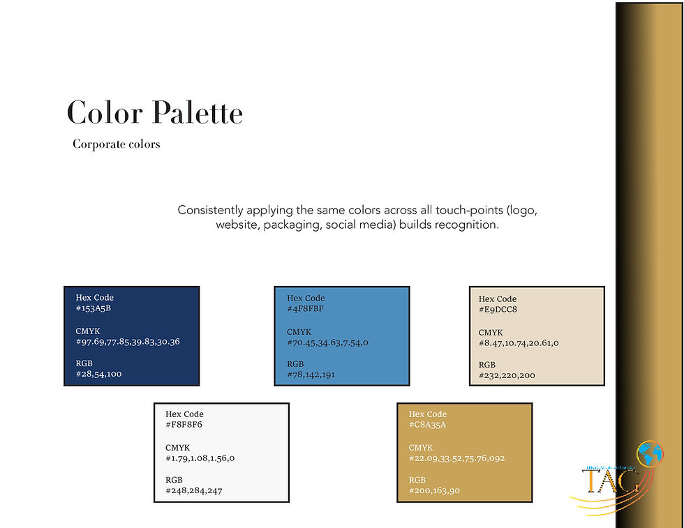
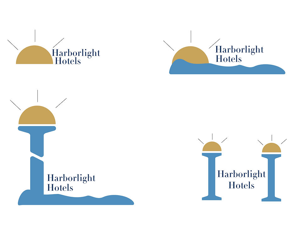
We explored logo concepts, color palettes, and typography that felt modern yet welcoming. Soft blues and warm neutrals helped capture the feeling of a peaceful stay by the water.
Step 3 – Refinement
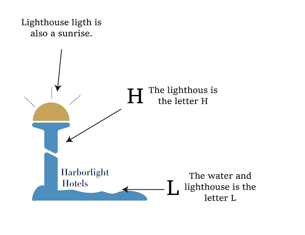
After reviewing early concepts with the team, we refined the logo mark, adjusted colors for better contrast, and polished the wordmark so it stayed clear and readable across signs and screens.
Step 4 – Delivery
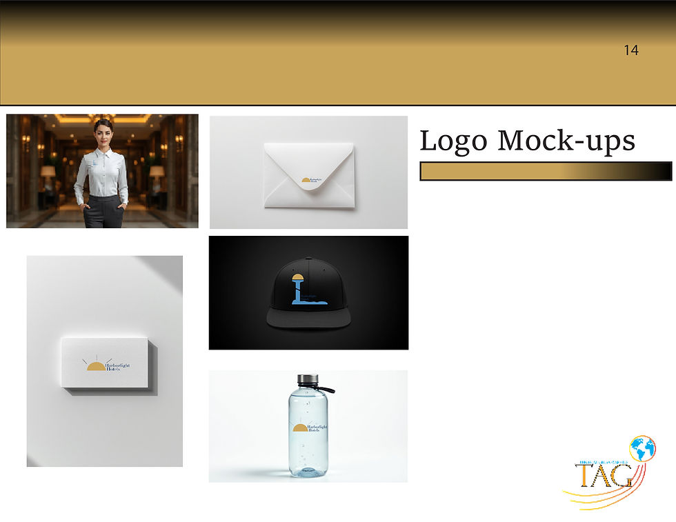
We delivered a full brand package, including logo files, color and type guidelines, and mockups for signage, keycards, and digital ads so HarborLight could roll out a consistent look across every property.
Ready to refresh your brand?
Whether you’re a hotel, nonprofit, or local business, we create thoughtful, faith‑friendly branding that serves your guests well.